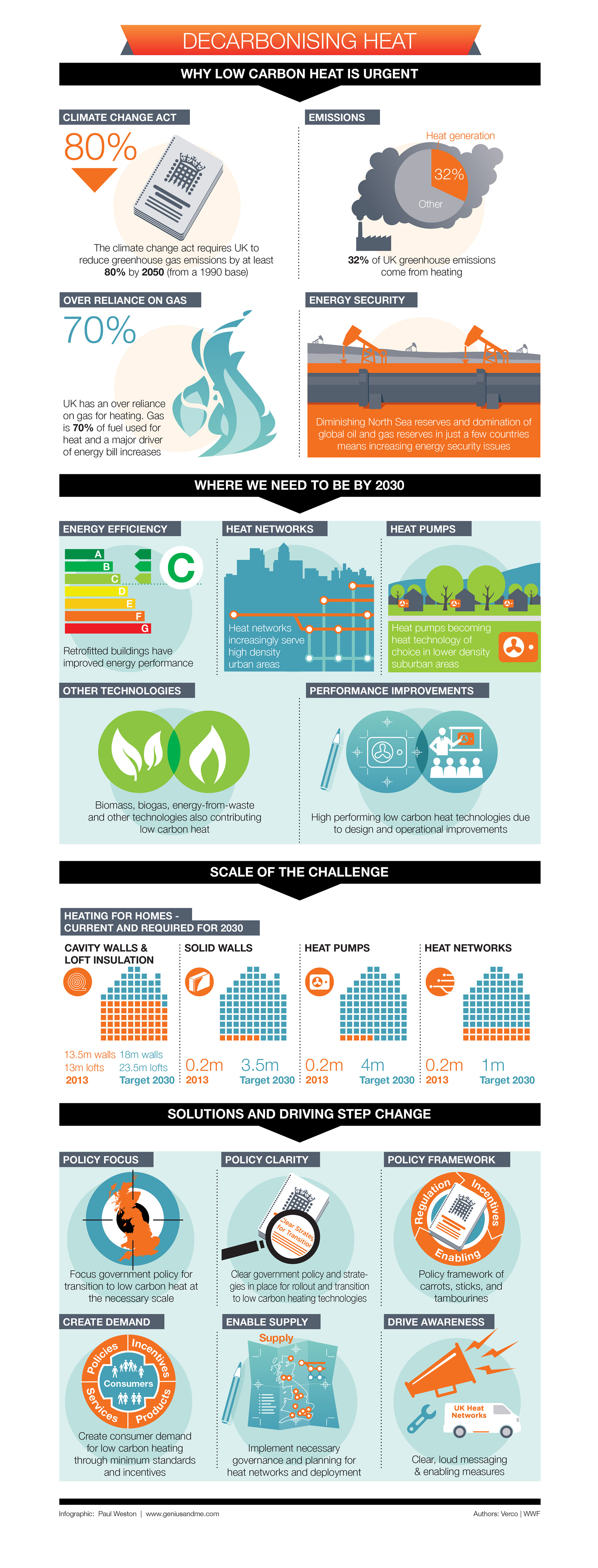
Presenting complex principles through text alone can be challenging, which is why I leverage the power of infographics to create easily understandable visual representations. For instance, I designed this piece on Decarbonising Heat that highlights the significance of low carbon heat and outlines the projected milestones that we need to achieve by 2030. The tower graphic makes the information more accessible and enables viewers to grasp the content quickly, no matter how intricate the topic.
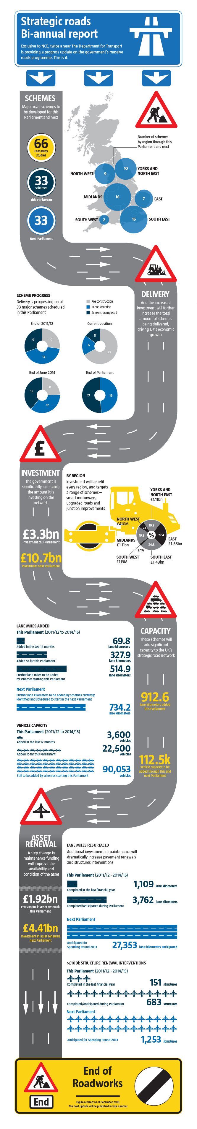
I designed this infographic for a Department for Transport report which showcased the major road schemes planned for the year along with the financial investment on the network. The centerpiece of this design was a tower graphic that used a flow-chart style to clearly and effectively display the information. The core data was presented in an easy-to-understand way, making it simple for viewers to comprehend the information.